
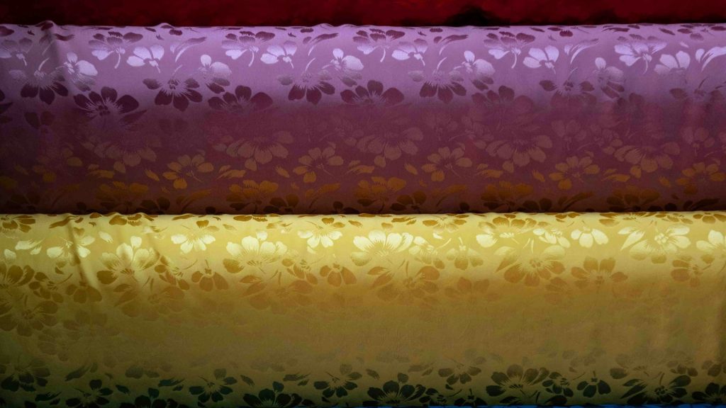
Fabric and craft supply sellers deal with a color accuracy problem that’s considerably higher stakes than it is for most product categories: a quilter matching thread to fabric, a knitter matching yarn dye lots, or a scrapbooker matching cardstock to an existing project is making a purchase decision entirely dependent on the photo representing the true color faithfully. Get that color even slightly wrong in editing, and a customer receives a product that doesn’t actually match what they thought they were buying, which in this category tends to produce far more returns and complaints than a similar color shift would in almost any other kind of store.
Why Color Accuracy Matters More for Fabric and Craft Supplies
Most product categories can tolerate a small amount of color drift between the photo and the physical item without much consequence — a slightly warmer-looking phone case or a slightly cooler-looking travel mug rarely triggers a return. Fabric, yarn, thread, and paper craft supplies are different, because buyers in this category are frequently trying to match a specific existing color exactly, whether that’s coordinating a quilt block, finishing a knitting project with a matching dye lot, or completing a scrapbook page that started with a particular cardstock. A photo that shifts true color even slightly can lead a buyer to purchase the wrong shade entirely, discovering the mismatch only once the physical product arrives.
The Specific Challenge of Photographing Textiles and Paper
Fabric and paper have their own optical properties that make consistent, accurate photography harder than it looks — texture and weave catch light differently across a bolt of fabric, paper stock can have a subtle sheen or matte finish that shifts how color reads under different lighting, and dye lots within the same nominal color can vary slightly from batch to batch in ways a seller needs to document honestly rather than smooth over in editing. A bulk editing process for this category needs to preserve these true characteristics rather than applying the kind of aggressive color correction that might make a completely different, unrelated product category look more uniform and appealing.
Why Manual Editing Introduces Dangerous Color Drift
A person manually color-correcting product photos one at a time, across a long editing session, naturally introduces small inconsistencies from image to image — normal human perceptual drift that most categories can absorb without real consequence. For fabric and craft supplies specifically, this drift is exactly the failure mode that causes the most customer frustration, since even a small, unintentional color shift from one editing session to the next can mean two photos of what should be the same color read as subtly different once live on the site, confusing buyers trying to coordinate a multi-fabric project.
A Bulk Workflow Built Around Color Fidelity
The practical approach starts with establishing a strict, consistent color calibration standard applied identically across an entire batch, rather than relying on per-image manual judgment that’s vulnerable to exactly the kind of drift this category can’t afford. Remove background in bulk free trials are worth testing specifically against a handful of your most color-critical fabrics or yarns before committing a full catalog to a new workflow, checking the output against your actual physical samples under consistent lighting to confirm true color is being preserved rather than subtly shifted during processing. A bulk background remover that’s been validated for color fidelity can then process an entire catalog of fabric and craft supply photos with confidence that the color a customer sees on screen matches what actually ships.
Documenting Dye Lot Variation Honestly
Because dye lots genuinely do vary slightly batch to batch in yarn and fabric, it’s worth building this reality into a bulk editing standard rather than treating every batch as needing to look identical to a reference photo. Edit multiple photos from each new dye lot or fabric run with the same consistent lighting and calibration settings, but let genuine physical color variation between lots show through honestly rather than correcting it away — a customer coordinating a large project actually needs to know if a new batch runs slightly warmer or cooler than a previous one, and honest, consistent photography is how that information gets communicated reliably.
Handling Swatches, Bolts, and Finished Project Photos Together
Fabric and craft supply listings often need to show multiple views of the same material — a close-up swatch showing texture and true color, a wider shot of the full bolt or skein, and sometimes a finished project photo demonstrating how the material looks once used. Batch edit pictures across all three image types using the same underlying color calibration, so a customer comparing the close-up swatch against the finished project photo sees a consistent color story rather than two images that appear to show slightly different shades of what’s supposed to be the same material.
What to Look for in a Tool for This Category
Given how much this category depends on faithful color reproduction, it’s worth confirming any bulk photo editor being considered offers genuine control over color accuracy rather than automatic “enhancement” settings that might boost saturation or shift white balance in ways that look appealing on other product types but actively work against what fabric and craft sellers need. Testing a tool against a physical color reference card, comparing the edited photo’s color values directly against the physical card under controlled lighting, is a more rigorous validation step worth taking in this category than in most others.
How Pixeroom Supports Fabric and Craft Supply Sellers
This is exactly the kind of color-critical batch work Pixeroom is built to handle carefully. Upload a batch of fabric, yarn, or paper craft photography, and its bulk image background remover processes the entire set with consistent, calibrated settings, preserving true color and texture rather than applying generic enhancement that could shift a customer’s perception of an exact shade. Mass edit photos across an entire catalog of materials, keeping color treatment consistent from swatch shots through finished project photography.
To be clear about scope: Pixeroom edits and exports the images themselves. It doesn’t replace the need for accurate original photography captured under proper, consistent lighting in the first place — no amount of careful bulk processing can fully correct for a poorly lit original photo that already misrepresents a fabric’s true color, so getting the capture stage right remains the seller’s responsibility. What it removes is the inconsistency that comes from manually color-correcting a growing catalog one image at a time, session after session, with all the natural human drift that process invites.
If your fabric or craft supply catalog has ever generated a return specifically because a customer said the color didn’t match what they expected, that’s worth treating as a signal to audit your current photo editing process for exactly this kind of drift, rather than assuming it’s an unavoidable cost of selling physical materials online. A properly calibrated bulk workflow, tested specifically for color fidelity, brings this risk down meaningfully across an entire catalog rather than requiring painstaking manual color-matching on every single listing.
Building Customer Trust Through Consistent Color Representation
Buyers who shop for fabric, yarn, and craft supplies regularly tend to become repeat customers of sellers whose photos they’ve learned to trust for accurate color representation, since finding a reliable source in this category solves a real, recurring pain point for anyone doing color-dependent project work. A seller who consistently gets color right, batch after batch, builds exactly this kind of trust over time, turning careful, tested photo editing into a genuine competitive advantage rather than just a cosmetic nice-to-have. That reputation, once earned, tends to be sticky — buyers who’ve been burned by inaccurate color photos elsewhere actively seek out sellers who have proven reliable, which makes consistent color fidelity one of the more durable ways a craft supply seller can differentiate in a crowded category.
Reprocessing an Older Catalog for Color Consistency
Sellers who’ve been photographing fabric and craft supplies for years, often under gradually changing lighting setups or camera equipment, frequently discover their catalog has quietly drifted in color consistency over time — older listings shot under one lighting standard, newer ones under a different, more current setup. Bulk edit images retroactively across the older layer of a catalog, applying today’s calibrated color standard, closes that gap without requiring a full reshoot of materials that already have perfectly good original photography behind an inconsistent edit. This kind of retroactive audit is worth prioritizing specifically for this category given how directly color inconsistency translates into customer complaints and returns.
Coordinating Multi-Piece Kits and Coordinated Collections
Many craft supply sellers offer coordinated kits or collections — a set of fabrics designed to work together in one quilt, a yarn collection meant to be used in combination — where color relationships between pieces matter as much as each individual color’s accuracy. Edit multiple photos within a coordinated collection using identical lighting and calibration settings, since even a small inconsistency between how two supposedly coordinating colors are photographed can make a kit look mismatched on screen even when the physical materials genuinely coordinate well in person. A bulk picture editor applied consistently across an entire kit’s photography is the most reliable way to preserve these carefully designed color relationships through to the final listing images.
Handling Seasonal and Limited-Edition Color Releases
Craft supply brands frequently release limited-edition colorways or seasonal collections, often under real time pressure to get photography live quickly while the seasonal window is still relevant. It’s worth resisting the temptation to rush color calibration for these releases specifically, since a limited-edition colorway that photographs even slightly wrong risks disappointing exactly the customers most excited and most likely to notice the discrepancy once their order arrives. A proven, already-tested bulk workflow handles a seasonal release with the same color rigor as the standing catalog, without requiring extra manual care under the added pressure of a tight launch window.
Supporting Customers Who Shop by Swatch Card Comparison
Many serious crafters keep physical swatch cards or color reference materials from previous purchases and shop new purchases specifically against those physical references, comparing an on-screen listing photo to a swatch they’re holding in hand. This puts unusually direct pressure on photo color accuracy, since the comparison a customer is making isn’t against memory or a general impression but against an actual physical color sample sitting right next to their screen. A rigorously calibrated bulk workflow, validated against real color reference cards during setup, is what makes a listing photo hold up to this kind of direct, side-by-side scrutiny rather than falling apart under it.
Training Yourself to Spot Color Drift Before Customers Do
Even with a calibrated bulk workflow in place, it’s worth building a habit of periodically comparing a handful of live listing photos directly against their physical materials under good lighting, catching any drift that might creep in from a display recalibration, a monitor change, or a subtle shift in original lighting equipment. This kind of spot-check takes only a few minutes but catches exactly the sort of slow, easy-to-miss color drift that a customer’s sharp eye — trained by years of matching fabric and yarn precisely — will notice immediately, long before it shows up as a pattern in your return data.
A quick monthly review of a small random sample of listings against physical stock is a low-cost habit that pays for itself the first time it catches a drift before it ever reaches a customer’s order.
Pair that habit with a genuinely reliable bulk editing process, and color accuracy becomes something you actively manage and verify, rather than something you simply hope holds up listing after listing across a catalog that keeps growing.
That combination of proactive verification and a dependable batch process is what separates sellers customers trust blindly from sellers customers double-check before buying.
In a category built on color trust, that difference shows up directly in repeat purchase rates over time.
Worth building deliberately rather than leaving to chance.
Start with the calibration, keep the spot-checks, and let both compound over every future release.