
Getting your Shopify product image size right sounds like a one-line answer, and partly it is: Shopify recommends 2048 x 2048 pixels for square product images. But sellers who stop there still end up with collection pages where some products look zoomed in, others float in too much white space, and a few load slowly on mobile. Size, aspect ratio, framing and file weight all work together. This guide walks through each one and shows how to keep an entire catalog consistent without editing every photo by hand.
The Short Answer: Recommended Shopify Product Image Size
According to the Shopify Help Center, a size of 2048 x 2048 px usually displays best for square product images. That resolution is large enough to support zoom on product pages while staying manageable as a file.
Upload Limits to Know
Shopify also sets upper limits on what you can upload. Product images must be smaller than 20 MB, and there is a ceiling on total pixel count expressed in megapixels. Shopify’s own documentation has listed slightly different pixel ceilings in different places over time, so if you work with very large camera files, check the current figure in the Help Center before a big upload. In practice, a 2048 px square file sits comfortably inside every published limit.
Accepted File Types
Shopify accepts common formats including JPEG, PNG and WebP, among others. Shopify’s image service then serves the best supported format to each visitor’s browser automatically, so you do not need to produce separate versions for different devices.
Why Size Alone Is Not Enough
A store can follow the recommended pixel dimensions perfectly and still look messy. The reasons usually come down to three things.
Inconsistent Aspect Ratios
Shopify’s Help Center points out that when product images are shown side by side on collection pages, they need a consistent aspect ratio to display at the same size. If one product photo is square, another is portrait and a third is landscape, the grid will look uneven or the theme will crop them in ways you did not choose.
Inconsistent Framing
Two square images can still look different if one product fills 90 percent of the frame and another fills 50 percent. Shoppers read that as a size difference between products, even when there is none.
Inconsistent Backgrounds
Off-white, grey and pure white backgrounds sitting next to each other make a catalog feel stitched together. This is one of the most common issues in stores that have grown over several years and photo sessions.
Choosing an Aspect Ratio for Your Store
Square (1:1) is the most common choice for Shopify product images, and it is a safe default because most themes are designed around it. It is not the only option.
Square (1:1)
- Works with most themes out of the box.
- Suits products that are roughly as wide as they are tall, such as cosmetics, homeware and accessories.
- Reuses well on marketplaces and social channels that favour square images.
Portrait (for Example 4:5 or 2:3)
- Gives tall products, like apparel on a model or bottles, more room.
- Takes up more vertical space on mobile, which can help a product stand out while scrolling.
- Needs a theme setting or consistent shooting so every product uses the same ratio.
Landscape
Landscape product images are less common, but can suit wide items like furniture or rugs. If you choose landscape, apply it to the whole collection rather than mixing.
Check Your Theme Settings
Many Shopify themes include a setting for product card image ratio, such as adapting to the image, forcing square or forcing portrait. Look in the theme editor under the product card or collection settings. Matching your photos to that setting avoids unexpected cropping.
Framing and Padding: Making Products Look the Same Size
Once ratio is settled, consistent framing is what makes a grid look professional.
Pick a Fill Percentage
Decide how much of the frame the product should occupy, for example roughly 80 to 85 percent of the longest side, and apply that to every image in a collection. Marketplaces like Amazon have their own fill rules for main images, which we compare in our guide to Amazon, Etsy and Google Shopping image requirements.
Center Consistently
Products that sit slightly left or high in the frame make the grid feel off, even when shoppers cannot say why. Centering every product on the same axis fixes it.
Leave Room for Badges
Many themes overlay sale or sold-out badges in a corner of the product card. Consistent padding keeps those badges from covering the product.
File Weight and Page Speed
A 2048 px image can be a few hundred kilobytes or several megabytes depending on format and compression. Shopify creates resized versions for different parts of your theme, but starting from a sensible file still helps.
Practical Tips
- Use JPEG or WebP for photographs and PNG when you need transparency or crisp graphics.
- Avoid uploading straight from a high-megapixel camera when a 2048 px export will do.
- Compress with a quality setting that keeps edges and textures sharp when zoomed.
For a deeper look at how images affect load time, see are your product photos slowing down your site.
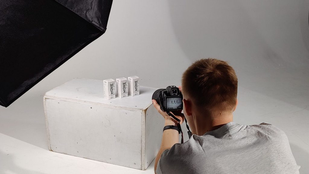
Shooting Source Photos That Resize Well
Good editing starts with good source files. A few habits during the shoot make every later step easier.
Shoot Larger Than You Need
Capture photos with more resolution than your final 2048 px export. That gives you room to crop to your chosen ratio and center the product without upscaling, which softens detail.
Leave Space Around the Product
Tight framing in camera makes it hard to add consistent padding later. Leave a margin on every side so the product can be centered and scaled to your fill percentage.
Keep Lighting Even
Even, diffused light makes background removal cleaner and keeps colors consistent from one product to the next. Harsh shadows and reflections take longer to fix, as covered in our guide to fixing common smartphone product photo problems.
Use the Same Setup Each Session
Mark the position of the camera, lights and product on your table. Repeating the same setup across sessions means new products slot into existing collections without extra editing.
Variant Images
Shopify lets you assign an image to each product variant, such as a color or material. When a shopper picks a variant, the product page switches to that image.
Keep Variants Identical in Framing
Variant images should share the exact same angle, ratio, background and fill so that switching between colors feels like the product is changing, not the photo. Shoot each variant from the same position and process them with the same preset.
Name Files Clearly
Use file names that include the product and variant, for example a product name followed by the color. It makes assigning images to variants faster and helps keep a large media library organised.
Main Image vs Additional Images
The first product image matters most, because it appears on collection pages, in search results and often in social shares.
The Featured Image
Keep the featured image clean and consistent across the catalog: same ratio, same background, same framing. This is the image doing the work on collection grids.
Additional Images
Secondary images can be more varied: lifestyle shots, scale shots, details and packaging. They still benefit from a consistent ratio so the product page gallery does not jump between sizes as shoppers swipe. If you are weighing clean shots against lifestyle photos, our A/B testing framework for product photos can help.
Alt Text
Every product image should have descriptive alt text. Shopify lets you add it for each media item. Describe what is in the image in plain words, which helps accessibility and image search. See building an accessible product catalog for more.
A Repeatable Workflow for a Consistent Shopify Catalog
Here is a straightforward process that works whether you have 20 products or 2,000.
- Choose one aspect ratio for featured images and match your theme setting to it.
- Choose a target size, such as 2048 x 2048 px for square.
- Choose a background, usually pure white or a single brand color.
- Choose a fill percentage and centering rule.
- Apply those settings to every image in a batch rather than one by one.
- Export in a web-friendly format and upload.
- Spot-check the collection grid on desktop and mobile.
Fixing an Existing Catalog
If your store already has hundreds of mixed images, start with best sellers and the collections that get the most traffic. Our guide to auditing old product listings covers how to prioritise.
How Pixeroom Helps With Shopify Product Images
Doing steps 3 to 6 by hand for every product is where most of the time goes. Pixeroom Studio is built for that part of the job. It removes backgrounds with AI, auto-centers each product with consistent padding, and lets you save templates and presets so every batch uses the same size, background and framing. You can bulk edit a whole set of images, export them as JPG, PNG or WEBP, and download the batch as a ZIP ready to upload to Shopify.
Because the same preset applies to every image, the second photoshoot matches the first, and new products added months later still match the rest of the catalog. If you sell on more than one channel, you can keep separate presets for each, as described in one photoshoot, five marketplaces.
Common Shopify Image Mistakes
Mixing Ratios on One Collection
This is the most visible problem on collection pages. Pick one ratio for featured images and stick to it.
Uploading Tiny Images
Images that are much smaller than the recommended size look soft when zoomed and can appear blurry on high-density screens.
Uploading Huge, Unoptimised Files
Very large files can hit upload limits and make your media library heavy to manage. Export at a sensible size instead.
Ignoring Mobile
Most stores get a large share of traffic on phones. Check how your product cards look on a small screen, where cramped framing is most noticeable.
Forgetting About Zoom
Many themes let shoppers zoom into product photos. Check that textures, stitching and labels stay sharp at full size before you upload a whole collection.
Text Baked Into Product Photos
Prices, discounts or badges written onto the image go out of date and do not translate. Use theme features for those instead.
Frequently Asked Questions
What is the best Shopify product image size?
Shopify’s Help Center says 2048 x 2048 px usually displays best for square product images. It supports zoom and stays within upload limits.
What is the maximum image size Shopify allows?
Product images must be under 20 MB, and there is also a megapixel ceiling. Shopify’s documentation has listed different pixel limits in different places, so check the current Help Center figure if you upload very large files.
Do all Shopify product images need to be square?
No, but every featured image in a collection should use the same aspect ratio. Square is the most common choice because most themes are built around it.
Why do my Shopify product images look different sizes?
Usually because of mixed aspect ratios or inconsistent framing. Use one ratio and a consistent fill percentage for every product.
Which file format should I use for Shopify product images?
JPEG or WebP for most photographs, and PNG when you need transparency. Shopify serves the best supported format to each browser automatically.
Does Shopify resize my images automatically?
Yes. Shopify creates different sizes of each image for different parts of your theme, so you only need to upload one good source file.
The Takeaway
The right Shopify product image size is the starting point, not the finish line. Pair 2048 px square images, or another single ratio that suits your products, with a consistent background, centering and padding, and your collection pages will look like one brand instead of a patchwork. If you have more than a handful of products, apply those rules in bulk so they stay consistent as your catalog grows. Try Pixeroom Studio on your next batch, or see the plans to find the right fit.