
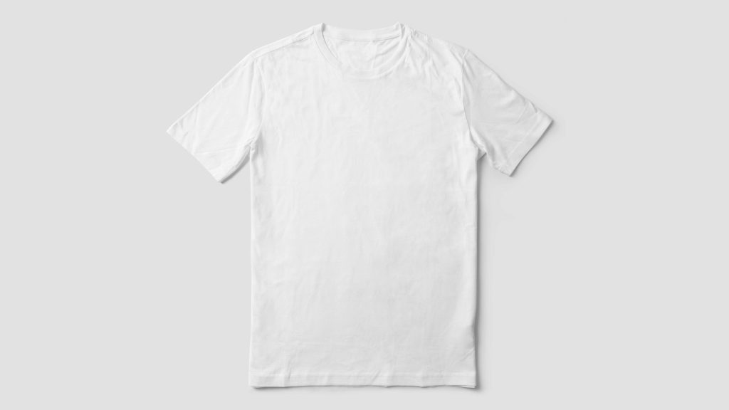
Print-on-demand selling solves a lot of problems at once — no inventory, no upfront production cost, a new design live within minutes of uploading artwork. What it doesn’t solve, and rarely gets discussed, is what happens to a storefront’s visual identity once dozens of designs across a dozen product types are all showing their supplier’s default mockup styling. A t-shirt mockup shot on one model in one pose, a mug mockup on a completely different table setting, a poster mockup in a frame style nobody chose on purpose — none of it was designed to look like it belongs to the same store, because none of it was. It was designed to look like a generic product catalog, because that’s what a mockup generator is actually built to produce.
Why POD Storefronts End Up Looking Disjointed
Every print-on-demand product type — apparel, mugs, wall art, phone cases, tote bags — typically ships with its own default mockup template from whichever supplier or platform generates it. These templates are built to showcase that specific product type in isolation, not to coordinate visually with every other product type a seller might also be selling. The result is a storefront where a customer can browse from a t-shirt to a poster to a coffee mug and see three completely different photographic styles, three different backgrounds, three different levels of visual polish, all technically representing products from the same brand. Individually, each mockup might look perfectly professional. Collectively, they read as a catalog of disconnected items rather than one coherent shop.
The Design-Multiplication Problem
POD sellers face their own version of the variant multiplication problem that other categories deal with, just shaped differently. A single design doesn’t multiply into color and size variants the way a physical product catalog would — it multiplies into product types. One design might need a mockup on a shirt, a hoodie, a mug, a poster, a tote bag, and a phone case, each generated from a completely different template with a completely different look. A seller with fifty designs available across even a modest six product types is managing three hundred images, none of which share a consistent visual language by default, purely because of how the mockup generation process works upstream of anything the seller actually controls.
Why Default Supplier Mockups Undercut Brand Consistency
The core issue isn’t that supplier-generated mockups look bad — most of them look perfectly fine on their own. It’s that they were never designed with any particular seller’s brand identity in mind, because the same template gets reused across every seller using that supplier. A shopper who’s browsed a few different POD stores starts to recognize the same stock mockup styling repeating across completely unrelated brands, which quietly undercuts the sense that any individual store has its own distinct identity. For sellers trying to build something that feels like a real, considered brand rather than a dropship-style catalog of generic mockups, this is a genuine problem worth solving, not a cosmetic nitpick.
A Bulk Workflow for Standardizing Mockups Across Product Types
The fix doesn’t require abandoning supplier mockups entirely or paying for custom photography of every product type — that’s rarely realistic for a POD business built around fast, low-overhead scaling. What actually works is treating the mockups as a starting point and applying a consistent bulk editing pass on top of them: swapping backgrounds to a shared brand color or texture across every product type, standardizing the crop and framing so a t-shirt and a mug occupy a visually similar amount of space in their respective listing photos, and applying the same lighting or color treatment across the board. A bulk photo editor that can process supplier mockups the same way it processes original product photography turns a scattered mix of default templates into a catalog that reads as one consistent visual system, without needing a photography budget most POD sellers were never going to have in the first place.
Because the underlying mockups already exist and just need a consistent background and framing treatment applied, this is squarely a batch job rather than a design project — upload the full set of mockups across every product type, and edit multiple photos with the same brand backdrop and centering rules in a single pass, rather than manually adjusting each product type’s default styling one at a time.
Balancing Standardization With Product-Specific Needs
It’s worth acknowledging that not every product type can be treated completely identically — a flat poster mockup and a worn t-shirt mockup have inherently different shapes and presentation needs, and forcing them into an identical template can look more awkward than the inconsistency it was meant to solve. The goal of standardization isn’t making every product type look literally the same, it’s making sure the elements that can be consistent — the background color, the overall lighting mood, the general framing approach — actually are, while leaving room for each product type’s natural presentation differences. A tote bag mockup and a phone case mockup don’t need to be interchangeable; they just need to look like they were edited by the same person with the same eye for the brand, rather than pulled from a dozen unrelated default templates.
Handling New Designs Without Restarting the Process
POD businesses tend to add new designs frequently, sometimes weekly, which means whatever consistency standard gets applied has to survive that pace without turning into a bottleneck. Once a bulk workflow is established — a specific backdrop, a specific centering approach, applied across every product type a new design gets mocked up on — adding a new design means running that same batch process again, not reinventing the visual treatment from scratch. Sellers who bulk edit images as a standing habit every time new designs launch keep their storefront consistent indefinitely, while sellers who only fix mockup consistency in occasional one-off cleanup projects find the problem re-accumulating every time a new design gets added in the meantime.
Auditing an Existing Catalog for Mockup Drift
For POD sellers who’ve been running for a while, it’s worth a periodic audit of the existing catalog specifically for mockup drift — designs added early on, before any consistency standard existed, sitting alongside newer, better-edited listings. Batch edit pictures across the older backlog using the same current standard, and a store’s oldest designs stop looking like a visibly different era of the business compared to what’s launching today. This kind of retroactive cleanup is exactly where bulk editing earns its keep, since reprocessing two hundred older mockups to match a current standard is a single organized batch job rather than two hundred individual manual edits.
What to Look for in a Tool for POD Mockup Editing
Because POD mockups arrive in such varied original styles — different backgrounds, different lighting, different product shapes — the editing tool needs to handle that variety well rather than assuming a tidy, uniform starting point. It’s worth checking whether a bulk picture editor can genuinely edit images in bulk across mockups from different suppliers and different product types in the same batch, since most POD sellers work with more than one supplier depending on which product type is being fulfilled. Testing a bulk photo editor free trial against a real, messy sample of your own actual mockups — not a clean demo set — is the only reliable way to know whether a tool handles the specific variety your storefront actually produces.
Coordinating Mockups Across Multiple Sales Channels
Many POD sellers list the same designs across a standalone Shopify store, an Etsy shop, and sometimes a marketplace listing simultaneously, and each channel often ends up with slightly different mockup exports pulled at different times from different suppliers. Bringing all of them into visual alignment means mass edit photos for every channel from the same standardized batch, rather than treating each platform’s mockups as a separate cleanup project. Because the underlying design artwork doesn’t change between channels, only the presentation does, the same brand-consistent backdrop and framing can be exported once and distributed everywhere a design gets listed, keeping the brand recognizable whether a customer discovers it on Etsy or the seller’s own site.
Deciding How Much to Standardize Versus How Much to Preserve
Some POD sellers intentionally lean into a slightly different presentation style per product category — playful and colorful for apparel, minimal and clean for home goods — as a deliberate brand choice rather than an oversight. That’s a legitimate approach as long as it’s a decision rather than a byproduct of unedited default mockups. The distinction that actually matters is whether the current look reflects a considered choice or simply whatever a supplier’s template happened to produce; a bulk editing pass can support either approach, applying one universal treatment or a small number of deliberately different treatments by category, as long as whichever approach gets chosen is applied consistently rather than varying by accident from listing to listing.
How Pixeroom Helps POD Sellers Build a Cohesive Storefront
This is exactly the gap Pixeroom is built to close for print-on-demand sellers. Upload a batch of supplier mockups spanning multiple product types — shirts, mugs, posters, whatever the catalog includes — and its bulk background remover strips out each one’s original default backdrop, replacing it with a consistent brand treatment across the entire set. A batch photo editor pass like this doesn’t require touching the actual product artwork or design files at all; it only changes the presentation layer around the mockup, leaving the design itself completely untouched. New designs launched afterward run through the same process, keeping the storefront visually coherent indefinitely rather than drifting back toward a scattered mix of default supplier styling.
To be clear about scope: Pixeroom edits and exports the mockup images themselves. It doesn’t generate the mockups in the first place, manage the print fulfillment relationship, or publish listings to a storefront — those pieces remain with whatever POD platform and supplier a seller is already using. What it changes is the one layer that’s entirely within a seller’s control: how those mockups actually present once they’re live, and whether they look like one considered brand or a pile of unrelated default templates stitched together by product type.
If your POD storefront currently looks like a collection of mismatched supplier templates rather than one cohesive brand, that’s not a reflection of your designs — it’s simply what happens when every product type ships its own default mockup style and nobody’s applied a consistent treatment on top. Fixing that doesn’t require new photography or a bigger budget. It requires treating your existing mockups as a batch worth editing together, the same way any other growing catalog eventually has to.
This matters more for print-on-demand specifically than for most other business models, because the design is genuinely the differentiator — the underlying blank product is often identical to what dozens of other sellers are also printing on. Visual presentation is one of the few remaining levers a POD seller controls directly, since the product itself, the fulfillment, and often even the base mockup templates are shared infrastructure used by countless other stores on the same platform. A consistently branded storefront is a real, defensible advantage in a category where almost everything else is commoditized by design, and it’s one of the few advantages that doesn’t require competing on price or finding a design nobody else has thought of yet.
None of this requires a redesign or a rebrand to get started — it’s usually a single afternoon spent choosing one backdrop and framing standard, followed by a batch run against the current catalog to see the difference immediately. Most sellers who make this change describe the same reaction: the designs themselves didn’t change at all, but the store suddenly looks like it was built with intention rather than assembled from whatever templates happened to come with each product type.
That perception shift alone is often worth more to a growing POD business than any single new design launch.