
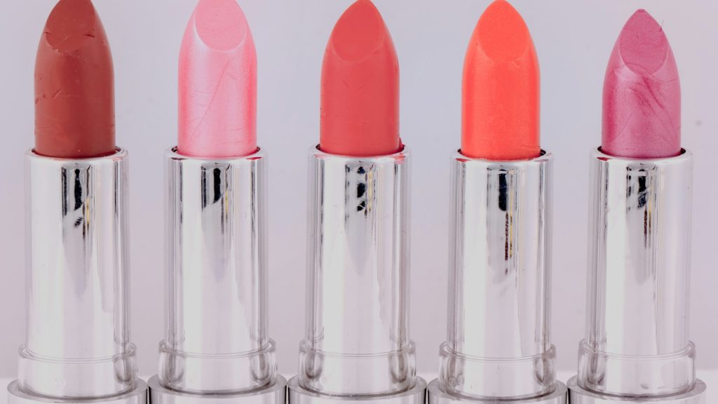
No product category depends on color accuracy quite the way beauty and cosmetics does. A shopper choosing between two nearly identical lipstick shades, or trying to figure out whether a foundation will match their actual skin tone, is making that decision almost entirely from a photo — and if the photo doesn’t represent the true color faithfully, the mismatch between expectation and reality shows up immediately once the product arrives. Shade-matching is arguably the single hardest photography problem in e-commerce, and it’s one that bulk editing can either solve at scale or quietly make worse, depending on how carefully it’s set up.
Why Shade Accuracy Makes or Breaks a Beauty Listing
Beauty shoppers aren’t evaluating a product’s general appeal the way a buyer browsing home decor might — they’re making a precise color decision that has to hold up once the product is actually applied to their skin. A shade that photographs even slightly warmer or cooler than its true tone can lead directly to a return, and unlike most product categories, the “misleading photo” problem here isn’t usually intentional exaggeration — it’s simply inconsistent white balance, lighting, or color correction creeping in across a catalog that was never edited to one strict, unified color standard.
This is also a category where returns are unusually costly. Many beauty products can’t be resold once opened, which means a shade-mismatch return often isn’t just a lost sale — it’s a product that has to be written off entirely. Getting color accuracy right in the photos isn’t a nice-to-have polish item for this category; it’s directly tied to margin.
The Specific Ways Bulk Editing Can Go Wrong for Cosmetics
Bulk editing tools built for general product photography often apply automatic color correction or exposure adjustments designed to make photos look more vibrant and appealing — exactly the wrong instinct for a category where the goal is representing color as precisely as possible rather than making it more visually striking. A generic auto-enhance setting that boosts saturation or warms up an image slightly can shift a shade’s actual appearance just enough to create a mismatch, even though the edit was technically applied consistently across the whole batch. The danger here isn’t inconsistency in the usual sense — it’s consistent, uniform distortion applied identically to every photo, which is arguably worse for this category because it doesn’t even show up as an obvious outlier during a quick visual check.
Building a Color-Neutral Editing Standard Across a Shade Range
The fix starts with treating color neutrality as an explicit requirement rather than assuming any bulk photo editor’s default settings are appropriate for this category. Shooting under consistent, color-accurate lighting is the foundation this depends on — no amount of editing fully corrects for wildly inconsistent original lighting conditions — but the editing layer on top needs to preserve that accuracy rather than introducing its own drift. A bulk background remover that swaps in a neutral gray or white backdrop without altering the product’s actual color values is doing the right job here; one that applies automatic color grading on top of the background swap is introducing exactly the risk this category can least afford.
Swatch Grids: Presenting Many Shades as One Coherent Comparison
Beyond individual product shots, beauty brands often need swatch grids — a single image or grid layout showing every shade in a range side by side, so a shopper can compare options directly. This is one of the more demanding bulk editing tasks in the category, because every swatch in that grid needs to be shot and processed under exactly the same conditions to be genuinely comparable; if even one swatch was captured under slightly different lighting, it throws off the relative comparison across the entire grid, not just that one shade. Bulk edit images from the same shoot session into a swatch grid, applying identical processing to every shade in the set, and the grid becomes a reliable comparison tool. Mix in a swatch shot from a different session, edited under even slightly different settings, and the whole grid’s usefulness as a comparison tool breaks down.
Balancing Warmth and Flattering Light Against Strict Accuracy
There’s a genuine tension worth naming honestly: beauty photography also benefits from warm, flattering lighting that makes products look appealing, and pure clinical color accuracy can sometimes look a little cold or unglamorous by comparison. The resolution isn’t picking one extreme over the other — it’s applying the same warmth or styling choice uniformly across the entire catalog, so that whatever aesthetic decision gets made, every shade and every product reflects it consistently rather than some photos getting the flattering treatment and others staying clinical. A consistent, deliberate style — even a slightly warm one — is far less risky than an inconsistent one, because shoppers can mentally calibrate for a consistent house style in a way they simply can’t for random photo-to-photo variation.
A Bulk Workflow for Launching a New Shade Range
When a new shade range launches, the practical workflow benefits enormously from processing the entire range as one coordinated batch rather than editing each new shade individually as it becomes available. Shoot every shade in the new range under identical lighting in one session, then edit multiple photos at once with the exact same background and color settings applied uniformly across the whole launch. This guarantees the new range matches both internally — shade to shade within the launch — and matches the established look of the rest of the catalog, rather than risking a new launch that photographs slightly differently from everything that came before it simply because it was edited on a different day, by a different person, or with slightly different settings.
What to Look for in a Tool When Color Accuracy Is Non-Negotiable
Given how much rides on color fidelity in this category, it’s worth testing any bulk picture editor specifically against a known, carefully measured product before trusting it with an entire shade range — compare the tool’s output directly against the physical product under controlled lighting, not just against how the photo looks in isolation. It’s also worth confirming that background removal and any automatic adjustments can be configured to preserve, rather than alter, the product’s true color values, since a tool built primarily for general product photography may not offer that level of control by default. Testing this carefully before committing an entire catalog to a new workflow matters more here than in almost any other product category.
Handling Packaging Reflections and Glossy Surfaces
Beauty packaging adds its own layer of difficulty on top of shade accuracy — glossy lipstick tubes, metallic compact cases, and glass bottles all reflect studio lighting in ways that can create bright hot spots or color casts that weren’t part of the original shoot conditions. A batch image background removal pass needs to handle these reflective surfaces carefully, since an aggressive edge-detection process can misread a bright reflection as part of the background and clip it incorrectly, leaving an unnatural edge around the product. Testing a bulk workflow specifically against your glossiest, most reflective packaging before trusting it with a full catalog catches this kind of issue while it’s still cheap to fix.
Keeping New Product Photography in Step With the Existing Catalog
As a beauty brand grows, it’s easy for photography style to drift subtly over months or years without anyone noticing until an older product sits next to a newly launched one and the difference becomes obvious. Periodically pulling the full catalog together and running a batch edit pictures pass against the current color and lighting standard catches this drift before it becomes a genuinely visible inconsistency across the storefront, the same way any other growing catalog benefits from periodic consistency checks — except here the stakes are higher, because color drift in this category directly translates into purchasing mistakes rather than just a slightly less polished visual impression.
How Pixeroom Supports Color-Accurate Beauty Catalogs
This is exactly the kind of precision Pixeroom is built to support for beauty and cosmetics catalogs. Upload a full shade range, and its bulk image background remover swaps out the original shooting background with a neutral, consistent backdrop without distorting the product’s actual color, while centering tools keep every swatch in a range framed identically for accurate side-by-side comparison. Mass edit photos from a single shoot into a complete, launch-ready catalog, with the same color-preserving settings applied uniformly across every shade, so a new range matches both itself internally and the established look of the rest of the store.
To be clear about scope: Pixeroom edits and exports the images themselves. It doesn’t perform color calibration on your camera or lighting setup, and it can’t fully correct for genuinely inconsistent original shooting conditions — accurate capture still has to happen at the shoot itself. What it does is make sure that whatever accurate color the original photo captured stays accurate and consistent through the editing process, rather than introducing new drift on top of whatever was already there.
If your beauty catalog has shade returns that feel higher than they should be, it’s worth auditing whether the photos themselves are part of the problem before assuming it’s simply the nature of selling cosmetics online. A catalog edited to a genuinely color-neutral standard, in bulk, across every shade and every launch, removes one of the most common and most preventable sources of shade-mismatch returns in the entire category.
Testing Shade Accuracy Before a Launch Goes Live
Before a new shade range goes live, it’s worth doing a deliberate accuracy check rather than assuming the batch process got everything right by default: pull a handful of finished, edited photos next to the physical products under neutral daylight, and confirm the on-screen color genuinely matches what’s in hand. This takes a few minutes and catches the kind of subtle color drift that’s easy to miss when reviewing photos in isolation, especially if the person reviewing has been looking at the same shade range for hours and has started to lose their sense of what “accurate” actually looks like. Building this quick physical comparison into the standard pre-launch checklist, alongside whatever other quality checks a beauty brand already runs, closes the loop between a batch process that’s technically consistent and one that’s actually accurate.
Documenting Undertones, Not Just Broad Shade Names
Beauty shoppers increasingly search and filter by undertone — warm, cool, neutral — in addition to broad shade categories, and a bulk editing standard that preserves overall color accuracy still needs to represent these finer undertone distinctions faithfully. Two foundation shades with a similar overall depth but different undertones need to photograph as genuinely different from each other, not flattened into visual sameness by an editing process that’s optimized for consistency at the expense of the subtle distinctions that actually matter to a shopper making a purchase decision. This is worth calling out explicitly as a review criterion when checking a finished batch, since “technically consistent” and “faithfully distinct where it matters” aren’t automatically the same thing, and a batch process tuned too aggressively toward uniformity can accidentally wash out exactly the differences a shopper is trying to compare.
None of this is meant to suggest color accuracy is an impossible standard to hit consistently — it’s simply a standard that needs to be treated as a deliberate requirement rather than assumed as a side effect of using any generic bulk editing tool. Brands that build this expectation into their workflow from the start tend to avoid the slow, expensive drift that comes from discovering the problem only after months of shade-mismatch returns have already piled up.
Treat color accuracy as a first-class requirement of the editing process, not an assumption, and the payoff shows up directly in a lower shade-mismatch return rate over time.
It’s one of the clearest examples in e-commerce where getting the technical details right in the photo editing step translates directly into a healthier bottom line.